How to Make B2B Calls-to-Action That Actually Convert
How to Make B2B Calls-to-Action That Actually Convert
In this day and age, how do you get visitors to actually notice and react? You combine visionary copywriting and a compelling call-to-action (CTA). Keep reading to learn how to create a clear call-to-action without the cliche hook.
Intention
The CTA is the most important content on a webpage, so always treat it as such. Start by asking “what do I want my visitor to do?” When you’ve got your answer, whether it’s sign up for a subscription, download a webinar, etc., it’s time to craft the language.
Craft a CTA that asks for a click instead of simply presenting the option. A strong action verb—“build,” “halt,” “invent”—usually does the trick. Need ideas? Download this mega-list. The right verb could add more clarity or broaden the meaning of your CTA, but it could also confuse the visitor.

Tip: Skim through the list and write out 10 or more options. You may be surprised of the extent different verbs can change a CTA. For example, inserting “Don’t” or “Do Not” in front of a verb (“Don’t Miss Out”) completely changes the feel.
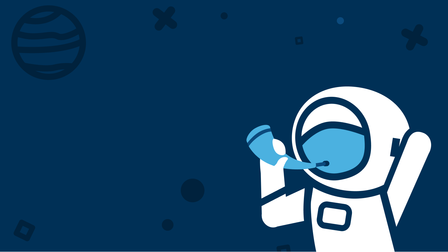
Sometimes, the best CTA is the one you wouldn’t expect. Stay away from cliché. Instead, add some spark. Check out this example from the NYC agency, Huemor. The page features a flying astronaut with a CTA that reads “Do Not Press.”
HubSpot found that a targeted CTA converts 42% more visitors into leads than an untargeted CTA. Your CRM can help with this by providing a different CTA depending on the visitor’s stage in the buyer’s journey.
Finally, using “you” or “your” will certainly tone down the command and warm up the copy, but BeemDigital found a 90% increase in click-through rate by implementing “Start my free 30 day trial” as opposed to “Start your free 30 day trial.” Use of the first-person voice gave customers the feeling of control.
Content
No matter the type of webpage you’re crafting, the copy should always point towards the next step in the journey. Give the visitors just a taste—enough that when they arrive at the CTA they’re hungry for more.

Axial Healthcare gives visitors a taste with infographic-style statistics. With a click, the visitors are presented an interactive graphic with even more clicks to explore targeted information.
Digital Reasoning presents their case in a way that promotes interaction and meets visitors where they are. The eye-catching statement in green revolves to present different solutions. Each solution directs to the same page, but depending on which one is clicked, it directs the visitor to a specific section of that page—immediately addressing their problem.

Upon entering Palinode’s website, they waste no time in telling the visitor what they do and how they do it. They even provide a personalized taste of how much their automated platform would benefit the visitor’s ROI. The visitor enters the website, immediately understands the function and attractiveness of Palinode’s platform, and is then met with data that motivates them to learn more about the product.

Design
CRM platforms like HubSpot and Eloqua have CTA tools that create links, facilitate easy placement, and automatically resize the CTA depending on the device. Once you settle on content, it’s up to the designer to employ it effectively.
The CTA should be placed after the solution has been presented. Effective CTAs are most commonly at the bottom of webpages, but it’s not a hard rule. It doesn’t hurt to place an additional CTA near the top or side of a webpage, but don’t overdo it. Giving the visitor too many options could result in choice paralysis—the visitor gets overwhelmed and avoids making a decision. Don’t surpass two CTAs per webpage, and make sure the most compelling and easily noticed CTA comes after the content. Visitors are looking for answers to their problems. Give them a solution and you’ll get their attention in return.
White Space
White space, also known as negative space, draws your eye to the object in the middle of it. Golden Spiral Designer Kyoko Eng, says, “There are no groups without space. One of the cornerstones of visual design is to group information to be easily digested in a particular way by the viewer. We can’t do that if there is no separation.”
Hubspot claims that busy space can cause cognitive fatigue, and when our brains are experiencing information overload, they have difficulty absorbing anything at all. When elements or text is pushed too closely together on a page, it becomes unapproachable and indigestible. White space—on its own or working with color and size elements—helps to focus the eye on what’s important.
Size and Shape
To contain enough space for a thumb to comfortably land, the size of a touch screen button should be 44 px by 44 px or larger. It could be telling to test whether a larger CTA (assuming there’s enough space on your webpage) vs. more white space around the CTA raises the CTR.
Our brains tend to find curved edges more attractive than jagged or sharp edges, so it couldn’t hurt to experiment with the shape of your CTA. Your audience may find a change in frame to be drastically more inviting.
Color
The common guideline for crafting a CTA is simple text on a solid color button. What people don’t always take time to consider is the color. Make sure your designer includes a contrasting color in their color palette to house the CTA. Visitors won’t convert if they don’t notice or can’t find the CTA. Remember, with clarity comes conversion. Many organizations have found that red and green are colors that generally convert well, but what truly matters is your audience. Colors are easy to test, so pick a couple options that contrast the webpage, yet still make sense within the color palette, and see which one works the best for you.
In Conclusion
Intentionality gets better results. It’s as simple as this: if you focus on intention, content, and design to create or upgrade your CTAs, you’ll see a positive effect in your conversion rates.
The views included in this article are entirely the work and thoughts of the author, and may not always reflect the views and opinions of Regex SEO.
Golden Spiral \ Marketing Manager